Logos
WSU logos are an instantly recognizable representation of the entire university, its campuses, its colleges, and its extensions. Inspired by the rich history that has brought us to today and our aspirations for the future, WSU logos incorporate visual elements and text treatments to provide brand familiarity and competitive differentiation worldwide.
The Cougar head
The Cougar head is the primary representation of the brand and most recognizable visual symbol of the university. The graphic beloved by Cougs was created by WSU student Randall Johnson in 1936. It appears in films, is waved on College GameDay broadcasts, and even made its way to outer space, pinned to Coug astronaut John Fabian’s suit while he was aboard space shuttle Challenger One.
Reinforcement of our primary identity builds brand equity, so the Cougar head should be used as the primary graphic identifier of the university in all communications. The Cougar head embedded in the shield should no longer be used. Depending on the background, we offer color variations, ensuring that applications of the core logo have the same visual fidelity anywhere someone encounters the WSU brand.
Core logos
The WSU logo, pairing the Cougar head and our hybrid typeface, is the centerpiece of our visual identity. It acts as a signature, an identifier, and the most visible representative of Washington State University. Everything is designed to flow from it. Every application is designed to align with it. And every piece of communication is strengthened by its consistent use.
The wordmark (Washington State University) is based on the Proxima Nova typeface. The “Washington State University” type has been customized, converted to outline, and registered as an official brand logo for WSU. Do not try to recreate the wordmark. Use only the official horizontal or vertical lockups as provided.
WSU’s logos and marks must be used as provided and may not be altered in any way.
To protect the integrity of WSU’s logos and marks, keep competing visual graphics outside the designated clear space.
Horizontal lockups
The primary horizontal lockup has three components that are always together, united to clearly and consistently register our brand:
- The Cougar head,
- The custom-created Washington State University wordmark, and
- A single line dividing the two.
Minimum width: 1.5″ or 150 px clear space for Primary Horizontal lockup
Vertical lockups
The vertical configuration of our logo (with the Cougar head and wordmark stacked) gives visual flexibility depending on the need. Vertical lockups are available to campuses, colleges, WSU Extension, the Alumni Association and WSU Foundation on the downloads page.
Minimum width: 1″ or 100 px clear space for Primary Vertical lockup
Clear space
We want our logo to stand out and be noticed. So we don’t crowd it. We give it space and allow it to breathe. By allowing sufficient “clear space” around it, we help ensure that our logo is both visible and legible.
Lockups for campuses, colleges, programs, and offices
Depending on the length of titles and other information, these lockups are designed to accommodate more text, while still emphasizing the primary logo.
Logos for executive offices, as well as Alumni Relations Foundation, and Extension are available for download. Please contact CAHNRS Marketing and Communications for guidelines on Extension-specific programming.
Custom logos outside these areas can be designed through Design and Printing Services. The first line will list Washington State University or WSU (campus location). Two additional lines of copy will be available. When determining that copy, please consider how the logo will be used with your target audience. Think function, not organizational charts.
Campus lockup
Campus lockup example. All campus and college lockups available on the downloads page.
Secondary mark
Our secondary mark, which combines the state of Washington with the letters W-S-U, highlights our statewide presence. The secondary mark should only be used to complement the core logos. It should never be used without the Cougar head present. For example, a T-shirt can feature a Coug head, with the state on a back or sleeve. Likewise, a publication may include a cover with the core logo, but for variety, also include the secondary mark on its back cover.
Guidance
Do use the appropriate clearspace around the logo

Do follow the minimum size requirements

Do use the approved logos

Do NOT modify, stretch, rotate, or distort the primary logo any way

Do NOT use the logo as a repeating element

Do NOT crop the logo

Do NOT use colors outside of the WSU Primary or Secondary Palette.
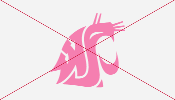
Do NOT fill the logo with a gradient, image, or pattern.
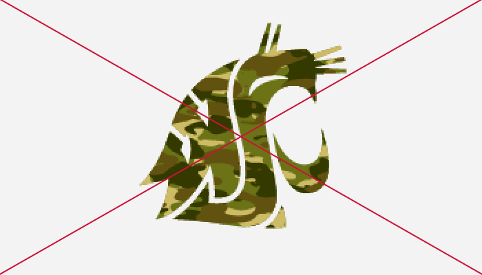
Do NOT place the logo on busy photographic background

Do NOT squish, rotate, or skew the logos.

Do NOT recreate the logos

Do NOT incorporate or combine any other university parts or names with other marks, symbols, or graphics.
